
Бренд, який знайомить бізнеси з юзерами крипти
CryptoProcessing by CoinsPaid — це платіжне рішення, що допомагає компаніям приймати платежі в крипті.
Бренд уже здобув сильну репутацію серед бізнесів,
які активно працюють із криптою. Проте для більш класичних галузей — FMCG, роздрібної торгівлі, електронної комерції та інших — криптовалютні платежі досі залишаються радше винятком, ніж звичною практикою.
Щоб зростати далі та виходити на нові ринки, бренду потрібно було переосмислення — від стратегії до візуальної айдентики.
Ми зіткнулися з амбітним завданням.

Відверто — світ крипти досі оповитий міфами та таємницями.
До цього часу ніхто точно не знає, хто її створив.
У масовій свідомості крипта міцно пов'язана з сумнівними схемами та гучними скандалами у новинах — тож і ті, хто нею користується, часто викликають недовіру.
Тому для багатьох підприємців криптоплатежі — це щось нове й, можливо, перспективне в майбутньому. Але точно не зараз. Це цікаво? Так. Має потенціал? Можливо. Але чи є в цьому нагальна потреба? Навряд. Саме тому рішення про впровадження криптооплат легко відкласти — на п’ять, десять, а то й двадцять років.


Але була одна велика
«сліпа зона» — те, чого підприємці ніколи не помічали, і про що категорія їм ніколи не говорила.

Крипта розвивається просто зараз.
Мільйони людей по всьому світу вже володіють нею — і і щодня їх стає більше.
Але головне не це. 1 з 7 власників крипти не просто зберігає її — він витрачає її на реальні продукти та послуги, а не тільки на NFT-картинки.
Саме тут ми побачили нашу можливість:
показати силу крипти через людей, які вже нею користуються.

Щоб подолати безликий образ криптотехнологій, CryptoProcessing бере на себе нову роль — познайомити підприємців з власниками крипти як із реальними людьми.
Наша мета — змінити уявлення про людей з криптою: з «загадкових криптанів» — на звичайних людей, які вже живуть серед нас.
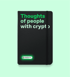
Ми поставили «People with crypto» в центр нового бренду замість усіх інших стереотипних ярликів, якими часто називають людей з криптою.
Щоб закріпити цей термін за нашим брендом, ми зробили «Meet People with crypto» новим слоганом, де «People with crypto» — це ядро, яке можна використовувати як на початку, так і в кінці повідомлення, що дає бренду гнучкість у комунікації.


Емоційно ми допомагаємо бізнесам встановити зв’язок із власниками крипти — через краще розуміння цих людей.
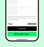
Функціонально — пропонуємо простий інструмент: кнопку, якою так само легко користуватися, як звичайною кнопкою оплати.
Візуальна айдентика
Крипта часто здається складною — і не лише через свою репутацію. Для багатьох бізнесів криптоплатежі виглядають заплутаними та складними. Саме тому наша візуальна айдентика мала виконати одне ключове завдання: зробити крипту простою — як для тих, хто впроваджує її, так і для тих, хто нею користується.
У своїй суті наш продукт простий. Це кнопка — на сайті, у додатку, будь-де, де потрібно зробити оплату. Саме з цього ми й почали роботу над візуальною айдентикою: з логотипу, який є кнопкою. На перший погляд він може здатися складним, але він створений для того, щоб рухатися, адаптуватися й працювати будь-де.


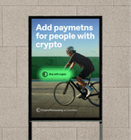
Ми зрозуміли, що кнопка необов’язково має жити лише в логотипі. Вона може стати частиною всієї візуальної айдентики — гнучким фреймом для будь-якого повідомлення.
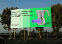
Цей підхід робить бренд більш грайливим і фокусує увагу на головному — людях, завдяки яким відбувається кожна транзакція. Наприклад, на Моніці з Амстердама, яка купує кавоварку за крипту. Або на Пітері з Лондона, який купує велосипед для свого сина.
Це візуальний спосіб показати те, у що ми віримо: люди з криптою — це цікаві люди, які можуть стати цікавими для багатьох бізнесів.


Градієнтні хвилі
Щойно відбувається взаємодія з логотипом, з’являються градієнтні хвилі, які оживляють усю айдентику — не лише візуально, а й концептуально.
Ці хвилі символізують дію, що відбувається прямо зараз — завершену транзакцію. І саме цю історію ми хочемо розповісти: крипта — це не далеке майбутнє. Вона вже тут. Нею вже користуються. Хвилі допомагають підсвітити цю реальність — світ, де люди роблять великі та малі покупки за крипту.
Ці градієнтні хвилі задають характер всій дизайн-системі: від кольорової палітри до структури макетів, стилю ілюстрацій і принципів анімації — усе випливає з хвиль. Динамічність системи дозволяє брендувати будь-які матеріали — від білборду до формульного боліда — і залишатись впізнаваними.


Adaptive layout system


Fernando Barrichello in Euroformula Open. Photo by Oli's MotorBlog


Агенція
банда
Creative Director
Yaroslav Serduk
Strategy Lead
Bohdan Hetmanov
Strategist
Alyona Koltunova
Art Director
Sasha Blagov
Art Director
Olha Bonius
Designer
Oleksii Hushko
Designer
Alex Babariko
Team Leader
Yevheniia Dvoretska
Project Manager
Anna Sukhomlinova
Більше проєктів
Клієнт
Проєкт
Рік
Індустрія
Дисципліна
- dok.ua = автозапчастиниTop of mind 17%, знання з підказкою 66%2025
- hashbankНовий грузинський необанк з європейськими амбіціями2025
- CodeUA від Мінцифри та Львівського IT кластеруУкраїнський tech-маркетплейс2025
- SKELARThe Next Big Everything2023
- Uber. Keep Ukraine Moving10 країн, 8,5 мільйонів доларів допомоги, 49 реанімобілів2023
- Google ЗнанняЗапуск бренду в Україні під час повномасштабного вторгнення2023
- Bravery — наймасштабніша комунікація від України2 мільярди контактів, 160 міст, 200 брендів2022
- MacPawMake useful unboring. MacPaw2022
- МЗС УкраїниОсоблива Республіка Крим2021
- ЧорнобильЄдиний офіційний брендинг для Зони, яка зникає2021
- GoodwineВино просто так2020
- ПриватБанкГотівка на касі2020
- ComfyКожен собака знає Сomfy2020
- ОККОПідозрілий кейс ОККО2020
- МолокіяПопроси трохи часу для себе. Сім’я тебе підтримає.2020
- NAMUЯ+GOD=A Реклама виставки Мирослава Ягоди в NAMU2020