Ребрендинг НАМУ

Старий – не означає нудний
В легендарній загадковій будівлі з левами на вулиці Грушевського зберігається тисячорічна історія України, втілена в стародавніх іконах, портретах, скульптурах, мозаїках, гобеленах, авангардних кубістичних та конструктивістських композиціях і так аж до сучасності. Українське мистецтво варте набагато більшої уваги, ніж отримує сьогодні, а майже за кожною картиною в експозиції музею ховається історія гідна серіалу для Нетфлікса.
Не історія з підручників, а історії з життя
Тут стала очевидною наша головна місія – перетворити імідж музею з образу старого нудного і притрушеного пилюкою мудреця на образ досі мудрого, але живого, активного, відкритого і зацікавленого вчителя. Такого, що дозволяє гуляти пари, якщо немає настрою, сидіти попою на парті і, найголовніше, мати власну думку з будь-якого приводу. Такого, що розповідає історії, а не мучить підручниковими термінами і нудними балачками.
А ще, у цьому випадку ребрендинг музею – це не лише зміна картинки. Оновлення в NAMU почалися задовго до нової айдентики. Сьогодні розвитком музею опікується нова команда професіоналів, людей, які точно знають, що таке добре і як це добре зробити реальністю.
Вмістити сотні років в один знак
Завдання не з легких і тому неймовірно цікаве.
Вже на старті разом з командою NAMU ми визначили найважливіші аспекти, про які має говорити нова айдентика національного музею.
Ми мали сказати і про українськість, про сучасність і динамічність музею і, звичайно, про мистецтво.
Та перший крок, що ми зробили тоді — привчили себе, а потім поставили задання і навчити країну називати Національний художній музей України — NAMU — National Art Museum of Ukraine. Тому що коли тобі є що розповісти про свою історію і своє мистецтво, і ти готовий розповідати про нього світу, то і робити це варто мовою світу.
В якийсь момент ми зрозуміли, що робимо не просто айдентику музею, ми робимо бренд для всього українського мистецтва.
Ольга Балашова, заступниця директора NAMU з питань розвитку

Before
After
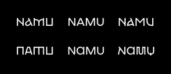
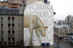
Новий знак та вся комунікація окрім всього іншого мала одночасно символізувати і довгу історію, і сьогодення, і демонструвати національну ідентичність і, звичайно, бути про мистецтво. Так ми зійшлися на тому, що основою айдентики NAMU має стати шрифт.
Мета була амбіційна, тож на допомогу ми покликали Діму Растворцева – шрифтового дизайнера. Він допоміг нам пірнути в тему ще глибше та поділився знаннями та досвідом. І ще за кілька місяців роботи, аналізу, експертизи та пошуків з’явився персональний шрифт Національного художнього музею України – NAMU Font.

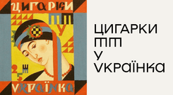
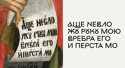

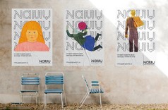
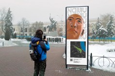
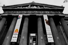
NAMU Font існує у семи варіаціях накреслення, кожна з яких відповідає за окрему епоху розвитку української культури та мистецтва. Починаючи з 16 сторіччя і закінчуючи сучасністю. Таким чином, будь-яка експозиція, або подія в NAMU може мати власний вид накреслення логотипу, той, що відповідатиме її часу. Сьоме ж накреслення – це сукупність всіх варіацій, симбіоз часів та поглядів і основа нової айдентики NAMU. Команда проекту збирали важливі символи по крихті з художніх творів, ікон, альманахів, журналів, листів та креслень. Мабуть, неможливо знайти бодай одну літеру шрифта, за якою не ховалася б велика історія. Власне, так само, як і з творами в експозиції музею. Namu Font залишиться у вільному доступі для всіх, хто тільки забажає. Важливою складовою робочого процесу була безперервна взаємодія з командою музею: ми обговорювали кроки, ділилися ідеями і слухали один одного, щоб задоволені були не лише дизайнерські амбіції, а й бажання людей, завдяки яким музей живе і оновлюється.
Як з цим жити
Визначившись з логотипом, ми взялися розробити систему айдентики. Те, як логотип живе, взаємодіє
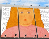
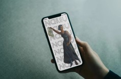
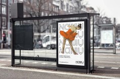
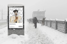
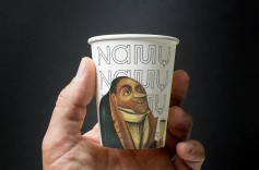
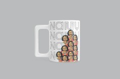
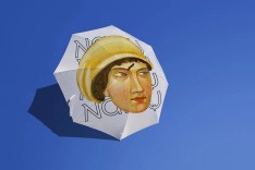
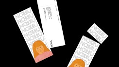
з іншими елементами комунікації, зі світом та людьми. В айдентиці знак NAMU стає основним впізнаваним елементом. Ми акцентуємо на ньому увагу, щоб одразу дати зрозуміти, що з глядачем спілкується оновлений бренд музея.
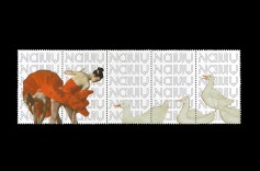
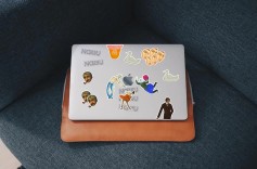
Новий логотип NAMU стає тлом для героїв картин, скульптур та всього, що можна знайти в музеї. Висуваючи твори на передній план, ми наче знайомимо людей з героями, підкреслюючи їхню унікальність, красу, те, що вони досі цікаві та актуальні. А ще, ми дозволили собі невеличку зухвалість: змінили масштабність творів, познайомили героїв різних картин у спільних матеріалах, відформатували так, як підказала композиція макетів. Ці прийоми дали можливість поглянути на звичне для багатьох мистецтво під інакшим кутом, з іншої відстані, в незвичному контексті.
Фактично, таким чином ми зробили нову айдентику NAMU суто з українського мистецтва.
Власне, у цьому і є вся історія NAMU:
це він спостерігає за кожною мистецькою легендою, за доленосними подіями, складними періодами та часами розквіту.
Він був там завжди і, ми думаємо, буде ще стільки ж.
Так класичне мистецтво поєдналося з сучасним дизайном, що робить комунікацію яскравою, помітною, та досі зберігає головну думку: з нами спілкується музей. Майже кожний твір тут ховає захопливий сюжет, який просто неможливо назавжди запакувати в раму і прибити до стіни.
Бо саме з цих маленьких і великих таємниць спліталася свого часу українська культура і ми готові розповісти про неї всім.


Клієнт
NAMU
Генеральна директорка
Юлія Литвинець
Заступниця генеральної директорки з питань розвитку
Ольга Балашова
Головна зберігачка
Ганна Вівчар
Заступниця генеральної директорки з виставкової та міжнародної діяльності
Юлія Гнат
Завідувачка відділу зв’язків з громадськістю
Валентина Клименко
Старша науковий співробітниця
Лідія Аполлонова
Агенція
банда
Creative Director
Павло Вржещ
Head of Art
Єгор Петров
Strategy Director
Ярослав Сердюк
Strategist
Ганна Боса
Art Director
Ілля Почкун
Copywriter
Марина Чернявська
Chief Designer
Антон Іванов
Senior Designer
Віктор Лондон
Designer
Слава Бондар
Designer
Даша Левчук
Designer
Ілля Шульженко
Junior Designer
Motion Designer
Ганна Ємельянова
Exposition Designer
Євген Величев
Type Designer
Account Manager
Аліна Мегидь
Більше проєктів
Клієнт
Проєкт
Рік
Індустрія
Дисципліна
- dok.ua = автозапчастиниTop of mind 17%, знання з підказкою 66%2025
- hashbankНовий грузинський необанк з європейськими амбіціями2025
- Сryptoprocessing by CoinspaidPeople with crypto2025
- CodeUA від Мінцифри та Львівського IT кластеруУкраїнський tech-маркетплейс2025
- SKELARThe Next Big Everything2023
- Uber. Keep Ukraine Moving10 країн, 8,5 мільйонів доларів допомоги, 49 реанімобілів2023
- Google ЗнанняЗапуск бренду в Україні під час повномасштабного вторгнення2023
- Bravery — наймасштабніша комунікація від України2 мільярди контактів, 160 міст, 200 брендів2022
- MacPawMake useful unboring. MacPaw2022
- МЗС УкраїниОсоблива Республіка Крим2021
- ЧорнобильЄдиний офіційний брендинг для Зони, яка зникає2021
- GoodwineВино просто так2020
- ПриватБанкГотівка на касі2020
- ComfyКожен собака знає Сomfy2020
- ОККОПідозрілий кейс ОККО2020
- МолокіяПопроси трохи часу для себе. Сім’я тебе підтримає.2020